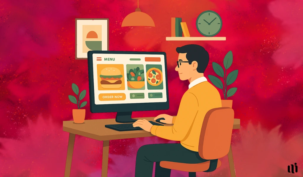
Do you want to build a perfect website for your culinary business? We got you.
Just like your blooming food business, you will need a perfect website that’s as seasoned as your signature dish. No expectation for bland designs, regular layouts, and 404 errors.
But structuring a perfect food website design that has great visuals while confirming smooth navigation can be hard.
Don’t worry! At Miraiyo, we cook up sites that truly serve.
| Whether you’re running a cozy café, a bustling restaurant, or a gourmet cloud kitchen, Miraiyo blends functionality with flavor to match your brand’s unique taste. |
In this article, we will share some of the best website design ideas that will take your website from basic to breathtaking.
Why Does a Good Website Design Matters for Restaurants, Food Chains, and Meal Sharing Brands?
A good website design helps your food business stand out in a crowded market. Plus, think of it as a part of your Business Intelligence Strategy.
It improves user experience by offering fast loading speed, mobile responsiveness, and clear call-to-action buttons.
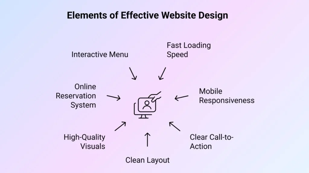
When your layout is clean and your visuals are high quality, customers trust your brand more.
For example, a restaurant with an online reservation system and an interactive menu can boost both traffic and conversions. You need a design that reflects your brand’s flavor while keeping functionality at the core.
In short, a good website design can,
- Builds trust with clean, modern design.
- Improves user experience and speed.
- Boosts online orders and bookings.
- Works well on all devices.
- Helps with SEO and visibility.
- Showcases menu and services clearly.
- Adds social proof through reviews.
The Secret Sauce Behind Irresistible Food Website Designs
Creating a food website that grabs attention isn’t just about pretty pictures. It’s about crafting an experience that feels as good as your best dish tastes.
🔶 Clean Layout With Focus on Visuals
A clean layout makes your website easier to explore and more enjoyable to use. When the design isn’t cluttered, your visitors can focus on what really matters, your food.
Strong visuals placed in a neat, structured layout grab attention fast. High-quality images paired with white space give your dishes room to shine and build trust with your audience.
Mexican food website Chiptole uses a minimalist layout with big, bold visuals of their burritos and bowls.
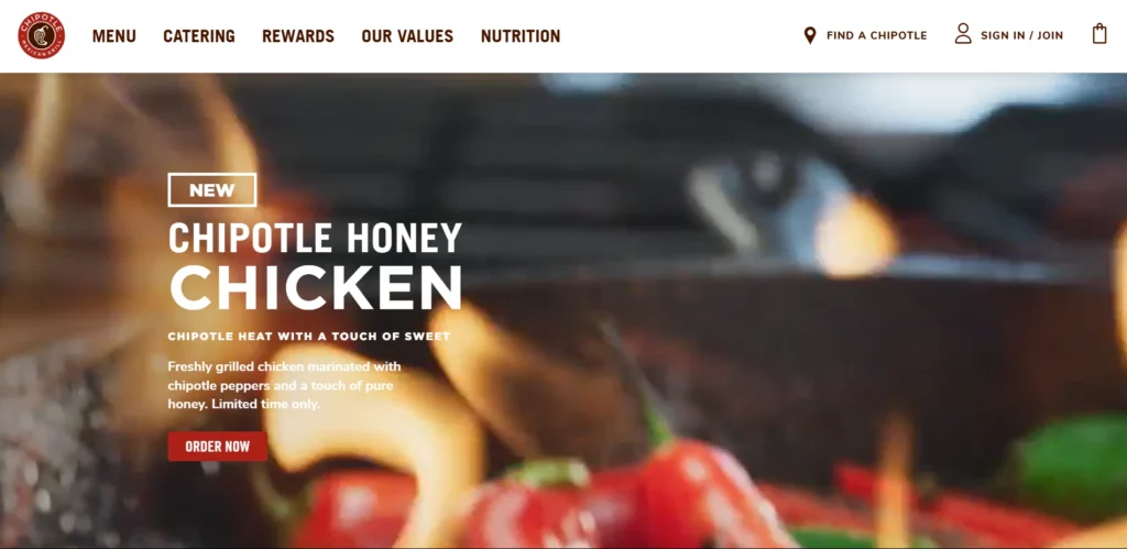
The homepage isn’t cluttered, you instantly see what they serve and how to get it.
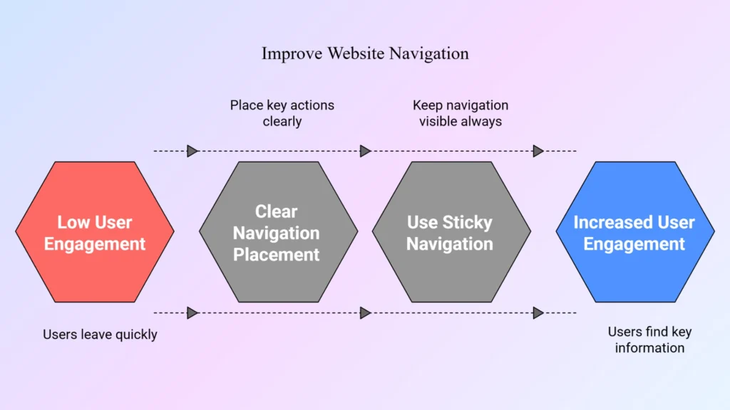
🔶 Easy Navigation & Mobile Optimization
Simple navigation helps users find what they need fast. Whether it’s the menu, contact info, or booking section, everything should be just a click away.
Mobile optimization ensures your site works smoothly on any device. With responsive design and fast load speed, you give users a seamless experience wherever they are.
🔶 Integration of Key Actions (Order, Book, Contact)
Make it easy for users to take action. Buttons for ordering, booking, or contacting you should be clearly visible and accessible on every page.
Simple call-to-actions increase engagement and make the journey from browsing to ordering effortless. The fewer clicks, the better.
Domino’s puts key actions front and center, “Order Now” is the first thing you see.

🔶 Professional Food Photography
Good food photography is essential. Sharp, well-lit images trigger cravings and highlight your food’s quality.
Professional visuals help people connect with your brand. They also make your menu items look more appealing and boost the chance of conversions.
🔶 Strong Branding Elements
Consistent branding builds recognition and trust. Your colors, fonts, and tone of voice should reflect your restaurant’s personality.
When your design elements align with your identity, your brand becomes memorable. It also helps set you apart from competitors.
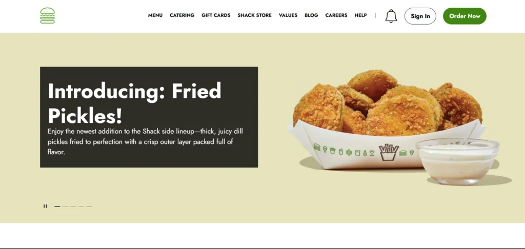
ShakeShack’s branding is consistent across the website, green tones, playful icons, and modern fonts. It reflects their fun, premium-fast-food vibe perfectly.
Turn Clicks into Cravings with these 8 Website Design for Ideas for Your Food Company
Discover 8 effective website design ideas to help your food business attract visitors and drive real results.
1. Add Motion-Based Visuals
Adding motion-based visuals, like subtle animations or short food preparation clips—can make your website more engaging. When done right, movement draws attention to key areas, like your signature dishes or limited-time offers.
It also keeps visitors on your page longer, which improves user interaction and boosts conversions.
You don’t need flashy effects. Even a looping video of sizzling food or a parallax scroll effect on the homepage can create a more immersive experience.
Take Mamma Joyce Peppa Sauce food website design as an example.
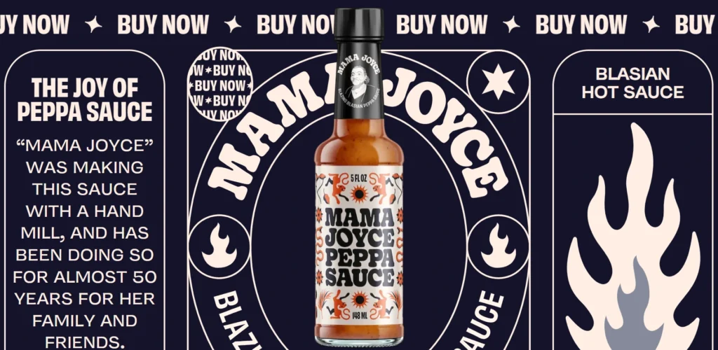
This website employs playful illustrations combined with motion graphics to create an engaging user experience. Well, the best part is the backend is not that impactful for site performance as well.
2. Use Color Psychology to Trigger Cravings
Color choices have a powerful impact on how people feel. Using warm tones like red, orange, and yellow can subtly increase appetite and make your dishes look more delicious. These colors stimulate emotional response and can guide visitor attention toward buttons or menu items.
Your brand’s color palette should reflect your food style too. For example, earthy tones work well for organic or plant-based brands, while bold hues match fast food energy.
Here’s what you need to know,
| Color | Effect on Appetite | Associations | Ideal For | Examples |
| 🔴 Red | Stimulates appetite and urgency | Energy, passion, excitement | Fast food, limited-time offers | McDonald’s, KFC, Five Guys |
| 🟡 Yellow | Increases hunger and grabs attention | Optimism, friendliness, youth | Promotions, call-to-action buttons | McDonald’s, Lay’s, Cheerios |
| 🟠 Orange | Encourages impulsive eating | Warmth, enthusiasm, affordability | Snacking brands, fast-casual restaurants | Fanta, Cheetos, Whataburger |
| 🟢 Green | Suggests freshness and health | Nature, sustainability, wellness | Organic food, vegan, salad brands | Sweetgreen, Whole Foods, Subway |
| 🔵 Blue | Suppresses appetite (use sparingly) | Calm, trust, cleanliness | Tech/UX areas of food sites (non-edible UI) | Pepsi, Oreo (used carefully) |
| 🟣 Purple | Suggests indulgence and creativity | Luxury, uniqueness, bold flavors | Desserts, wine, premium chocolates | Cadbury, Wonka, Starbucks Reserve |
| 🤍 White | Neutral, emphasizes cleanliness | Purity, simplicity, elegance | Backgrounds for food photography | Milk Bar, HelloFresh |
| 🖤 Black | Emphasizes boldness and sophistication | Premium, mystery, modern | High-end restaurants or dark themes | Nespresso, Magnum Ice Cream |
3. Introduce a Signature Dish Spotlight Section
Highlighting your best-selling or most unique dish gives users a reason to stay curious and explore more.
A dedicated spotlight section on the homepage or menu page can create a strong first impression. Pair the feature with a high-quality photo and a short story or chef’s note to make it more personal.
This section builds trust and simplifies choices for first-time visitors. When users instantly see what you’re proud of, they’re more likely to place an order or book a table.
Pizza Pilgrims‘ website effectively spotlights their signature Neapolitan pizzas.

The homepage features vibrant images of their most popular pizzas, accompanied by engaging descriptions that tell the story behind each creation.
4. Gamify the Menu Experience
Turning your menu into an interactive experience adds a fun, modern twist to your site. Think sliders to build a burger, hover effects that reveal ingredients, or clickable icons that show dish popularity.
KFC Japan launched an advergame called “Shrimp Attack” to promote their new shrimp menu items.
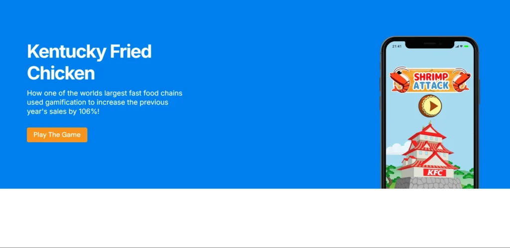
In this game, players defend their shrimp dishes from invading enemies, creating a fun and interactive way to introduce new products.
These features keep users engaged longer and make exploring your offerings feel fresh.
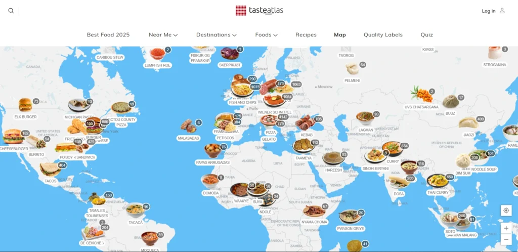
5. You can Create a Taste Map
A “taste map” helps guide users through your menu based on flavors, spice levels, or regional styles. It’s a unique visual layout that simplifies decision-making by aligning dishes with personal preferences. It also makes your website more interactive and data-rich.
You can present it as a chart, flavor wheel, or clickable map, depending on your branding style. Just keep it less cluttered and more simplified!
TasteAtlas offers an interactive map showcasing traditional dishes from around the world.
6. Include “Food Mood” Photo Blocks
Create sections where dishes are grouped by moods, comfort food, light bites, or party snacks.
This layout helps users connect emotionally with the food and makes browsing more intuitive. Visual blocks or mood-based filters add a layer of personalization to the menu experience.
Sweetgreen‘s website utilizes a clean, minimalist design featuring high-quality images of their fresh, seasonal salads and bowls.
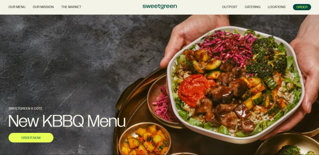
These “Food Mood” photos align with their health-conscious brand identity.
Mood-based design helps tell a story without needing words. Well, you’re not just selling a dish, you’re offering a vibe.
7. How about Adding Story Highlights or Food Reels
Short videos or mini reels showing behind-the-scenes, chef moments, or how a dish is made can be a powerful engagement tool. These bite-sized visuals feel authentic and give users a deeper connection to your brand.
Levy Restaurants utilizes Instagram story highlights to showcase behind-the-scenes content, special events, and featured dishes.
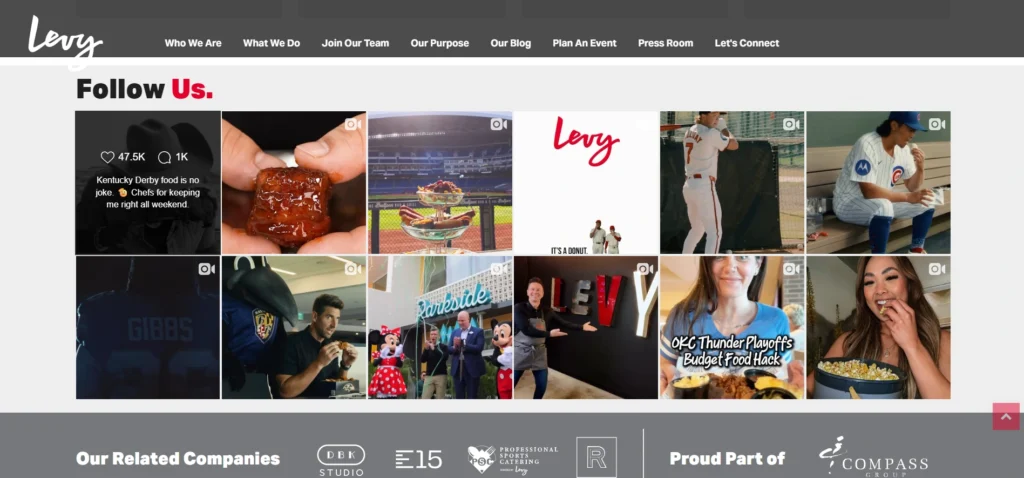
Maybe they are Humanity’s Strongest Restaurant 🙂
Embedding highlights directly into your homepage or using them like social stories adds a modern, personal touch.
It also keeps your site fresh and dynamic, especially for regular updates.
8. Offer a “Build Your Meal” Feature Page
Letting users customize their meals adds value and control. A “build your meal” feature allows users to mix and match base items, toppings, sides, or sauces. It’s especially useful for fast-casual, vegan, or allergy-conscious menus.
ICON Meals provides a customizable meal builder that allows users to select proteins, sides, and other components to create personalized meals.
This customization feature can give more flexibility to individual preferences.
5 Mistakes That Ruins Your Food Website Design
Even the best recipes can fall flat if your website design is missing key ingredients—here are five mistakes to avoid.
1. Overloading with too Many Photos
Using high-quality photos is important, but adding too many can clutter your layout and slow down your site. When every section is filled with large, detailed images, your users might feel overwhelmed or distracted.

You need to balance visuals with white space to guide attention and keep the experience smooth.
2. Not Optimizing for Mobile Users
More people browse restaurant websites from their phones than desktops. If your website isn’t mobile-friendly, you’re likely losing potential customers. Menus should be readable without zooming, buttons should be easy to tap, and loading times should be fast.
3. Hidden Menu or Contact Info
If users can’t find your menu or contact details within a few seconds, they’ll leave. You should always place these key actions in clear, accessible areas, preferably in the header or via sticky navigation.
4. Inconsistent Branding Across Pages
Your website should look and feel like one seamless experience. When you switch up fonts, colors, or tone between pages, it can confuse your visitors. Branding consistency builds trust and helps users recognize your identity instantly.
5. Ignoring SEO or Slow Site Speed
A beautiful design means nothing if no one can find your website or if it takes forever to load. SEO basics like proper titles, image alt text, and structured content help your site appear in search results.
At the same time, fast-loading pages keep users from bouncing.
FAQ
Should a food website have a FAQ section?
Yes. A FAQ section answers common questions like delivery, allergens, and booking info. It improves user experience, saves time, and helps with SEO. It also shows that you’re transparent and care about customer clarity.
What makes a good food website layout?
A clean, easy-to-navigate layout with strong visuals, clear sections, and mobile responsiveness. It should guide users naturally and reflect your brand. A thoughtful layout keeps visitors engaged and more likely to take action.
Should I add professional videos on my website?
Yes. Short, high-quality videos can showcase your food, share your story, and boost engagement. Just keep them optimized for fast loading.
Take These Ingredients and Build Your Digital Kitchen
Your website is more than just a menu online, it’s the front door to your entire food brand. From layout to color, motion to mood, every design choice you make shapes how people experience your culinary world.
With the right mix of visuals, functionality, and smart user experience, you can turn first-time visitors into loyal customers.
Need a trusted partner to bring your food website to life? Miraiyo specializes in crafting standout digital experiences for food brands.

Like how you show real life examples, this works.